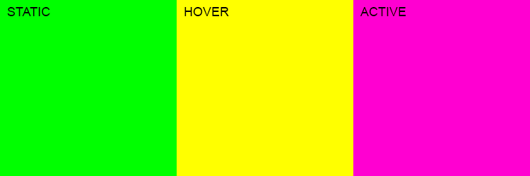
Image sprites are collections of individual images that have been condensed into a single image file. For example, the file we made in class:
shows the three states of our button (static, hover, and active) in a single GIF image. If we now build our anchor tag using the following HTML code:
<a class="button" href="http://parsons.edu">Parsons</a>
We can apply the following CSS to produce the rollover effect:
.button {
	display: block;
	width: 250px;
	height: 250px;
	background-image: url('sprite.gif');
	background-repeat: no-repeat;
	overflow:hidden;
	text-indent:100%;
	white-space: nowrap;
}

.button:hover {
	background-position: -250px 0;
}

.button:active {
	background-position: -500px 0;
}
The resulting button should look something like this:
If we apply position: relative; to a div containing a series of other elements, we are able to give each element an absolute position that is relative to the borders of the container. For example:
The CSS for the boxes above is as follows:
.container {
	width: 200px;
	height: 350px;
	background-color: yellow;
	position: relative;
}

.shape {
	width:100px;
	height: 220px;
	background-color: black;
	position: absolute;
	top: 40px;
	left: 40px;
}

.shape-two {
	position: absolute;
	top: 20px;
	left: 20px;
	width: 40px;
	height: 60px;
	background-color: red;
}

.shape-three {
	position: absolute;
	top: 10px;
	left: 10px;
	width: 20px;
	height: 30px;
	background-color: lime;
}Using the tricks we discussed in class we are able to create non-rectangular shapes in CSS. For example, a circle:
can be made using the following code:
.circle {
	width: 300px;
	height: 300px;
	background-color: red;
	border-radius: 150px;
}
And to make a triangle:
we can use the following:
.triangle {
	border-bottom: none;
	border-top: 400px solid blue;
	border-right: 240px solid transparent;
	border-left: 240px solid transparent;
	width:0;
}We can use the CSS property z-index to order elements on our page. By default, layer order is determined by the order in which elements are presented in the HTML page. So if your HTML document contains:
<div id="one"></div>
<div id="two"></div>
#two will appear on top of #one.
Using the z-index property allows us to override this. In the example we built in class:
we are using the hover psuedo-class to give .pop a z-index of 1, forcing it to the top of the layer stack. The example above uses the following CSS code:
.z-contain {
	width:600px;
	height:600px;
	background-color:#eee;
	position:relative;
}

.pop {
	position: absolute;
	width:300px;
	height:300px;
}

.pop:hover {
	z-index:1;
}

.one {
	top: 40px;
	left: 40px;
	background-color: lime;

}

.two {
	top: 60px;
	left: 60px;
	background-color: yellow;

}

.three {
	top: 80px;
	left: 80px;
	background-color: blue;

}

.four {
	top: 100px;
	left: 100px;
	background-color: red;
}We can use the transition property to animate between to states:
.button {
    background-color: blue;
    height: 200px;
    width: 200px;
    border-radius: 100%;
    transition: all 2s;
    font-family: Arial, sans-serif;
    font-weight: bold;
    font-size: 20px;
    line-height: 200px;
    color: red;
    text-align: center;
}

.button:hover {
    width: 300px;
    height: 300px;
    background-color: red;
    line-height: 300px;
    color: white;
}
The resulting button should look something like this:
We can create an animation using the @keyframes syntax:
.clock {
    width: 200px;
    height: 200px;
    position: relative;
    animation-name: myclock;
    animation-duration: 10s;
    animation-timing-function: linear;
    animation-iteration-count: infinite;
}

.seconds {
    width: 200px;
    height: 4px;
    background-color: black;
    position: absolute;
    top: 98px;
    left: 0px;
}

@keyframes myclock {
    from {
        transform: rotate(0deg);
    }
    to {
        transform: rotate(360deg);
    }
}
The above produces the following example: