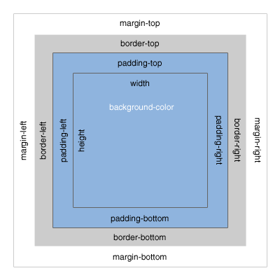
HTML elements (div, a, li, etc) are rendered as boxes by the browser. This is often referred to as the “box model”. Every HTML element (or box) on a page consists of: margins, borders, padding, and the actual content. The box model allows us to space elements in relation to other elements.

The above illustrates the basic box model, consisting of Margin, Border, Padding and Content Width and Height.
Margin clears an area around the border. The margin does not have a background color, it is completely transparent.
Border wraps the padding and content. The border is affected by the background color of the box.
Padding clears an area around the content. The padding is affected by the background color of the box.
When you set the width and height properties of an element with CSS, you just set the width and height of the content area. To calculate the full size of an element, you must also add the padding, borders and margins.
The CSS for the box above is as follows:
width:250px;
padding:10px;
border:5px solid gray;
margin:10px;
To calculate the total width we would add the following:
Using the CSS float property allows us to position elements next to each other. For example:
Both of the above boxes have the following CSS attributes applied:
width:100px;
height:100px;
margin:20px;
padding:20px;
float:left;
background-color:yellow;
In this case, the two divs are floated left. Elements can be floated to the left or right, allowing content to flow around their containing box.
Alternatively, we can set the display property of an element to inline-block to position it within the flow of our document.
Using our exampple divs above, if we remove float: left and instead set display: inline-block, we see our browser return a similar result:
It’s important to remember here that, because our elements are now set inline with all the other content of our page, whitespace between these two divs creates an actual space character within our browser. This can be avoided by either removing any witespace between inline-block elements, or by setting font-size to 0 on the parent element.